Your Startup's Logo Looks Like a Stock Canva Template. (Yes, Everyone Can Tell!)
10 July 2026
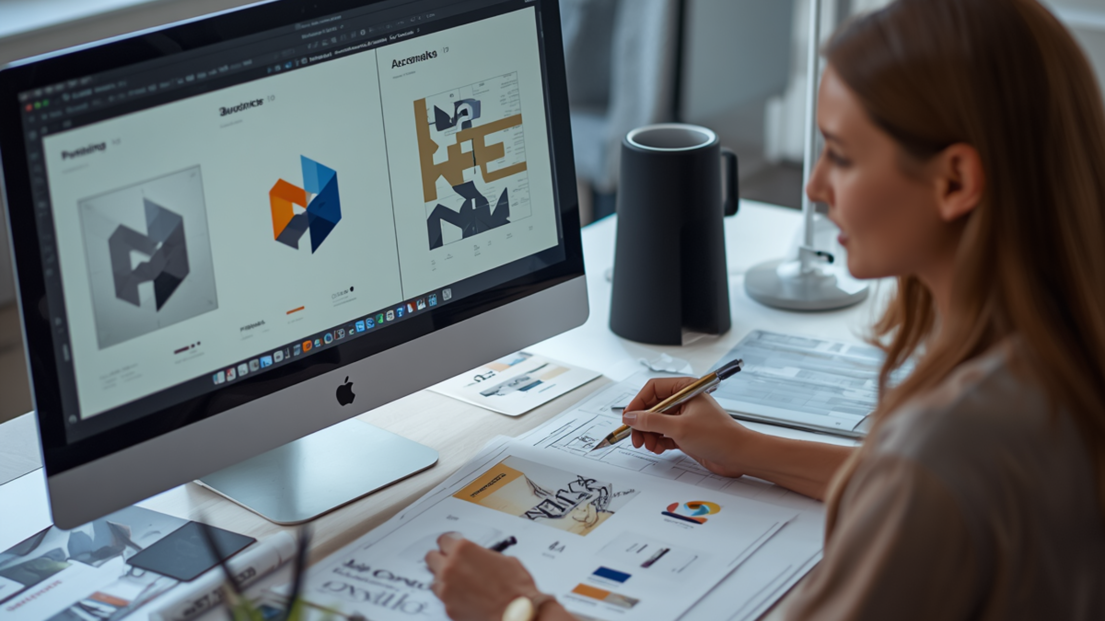
Cutting corners on your visual identity? Interlocking minimalist triangles and default font pairings tell investors and clients you aren't serious. Here is why stock logos kill credibility.
You’ve poured your life savings, endless sleepless nights, and your best disruptive ideas into your new venture. You’re ready to launch in the UK market. But then, you roll out your branding, and the collective reaction is a quiet, polite nod. Why? Because your startup's logo looks like a stock Canva template. And yes, everyone can tell.
When you are trying to establish a footprint, cutting corners on visual identity is a trap. Many founders turn to quick, automated fixes. However, if you look at the premium bespoke work offered by professional agencies, such as our tailored logo design packages in Birmingham, the difference in market authority is night and day. A template might get you online by Tuesday, but it won’t build a brand that lasts until 2030.
At Website for Startups, we see this mistake constantly. Here is why relying on stock templates is hurting your business, and how everyone knows exactly where you got it.
The Problem of the Overused Geometry
We all know the templates. It’s the interlocking minimalist triangles for a tech firm, the single continuous-line leaf for a wellness brand, or the generic abstract holding hands circle for a charity or HR consultancy.
When Canva provides a beautiful template, they provide it to millions of users globally. If you use that exact layout, your brand instantly gets buried in a sea of identically looking businesses. In the business ecosystem, distinctiveness is your primary currency. If your visual identity looks exactly like a local dry cleaner, a boutique cafe in another city, and an app on the App Store, your credibility plummets.
Font Combinations that Scream Default
Canva has a spectacular library of typography, but certain pairings have become the Comic Sans of the modern corporate world. The combination of a stark, bold sans-serif headline like Montserrat paired with a clean subtext line is recognisable from a mile away.
Professional typography and design experts don't just choose a font because it is trendy; they manually tweak kerning and ligatures and balance out the font weights so that the text will uniquely fit with the logo of your brand. This customisation cannot be provided by a generic template.
Colours with No Core Context
Templates rely on trendy palettes. Think pastel pinks paired with sage green, or bright neon electric blues on a dark charcoal background. While these look fantastic on a generic digital mood board, they rarely align with a startup’s specific strategic positioning, target demographic, or physical printing constraints. A human designer crafts a palette based on psychological triggers, cultural context, and long-term brand utility.
Your Visual Foundation Deserves More
Your logo is the first touchpoint for investors, clients, and partners. It tells the world how seriously you take your own business. Investing in custom, strategic visual design is an investment in your company’s equity.
Whether you are exploring specialised design agencies or checking out the comprehensive logo design packages in Liverpool, opting for real, human-crafted design ensures that your brand asset is fully trademarkable, entirely unique, and purpose-built for your market.
Let’s Build a Unique Identity
Stop blending into the background with generic graphics that dilute your hard work. We specialise in crafting completely bespoke digital identities that resonate with UK audiences and stand out in crowded markets.
Ready to elevate your branding from a generic template to an industry leader? Get in touch with the Website for Startups team today, and let's craft a distinct visual identity that belongs entirely to you.