Why Are Startup Websites Either Boring Or Completely Unhinged?
25 June 2026
Is your startup site a boring corporate clone or a chaotic mess? Strike the perfect balance with expert web design packages in the UK that actually convert.
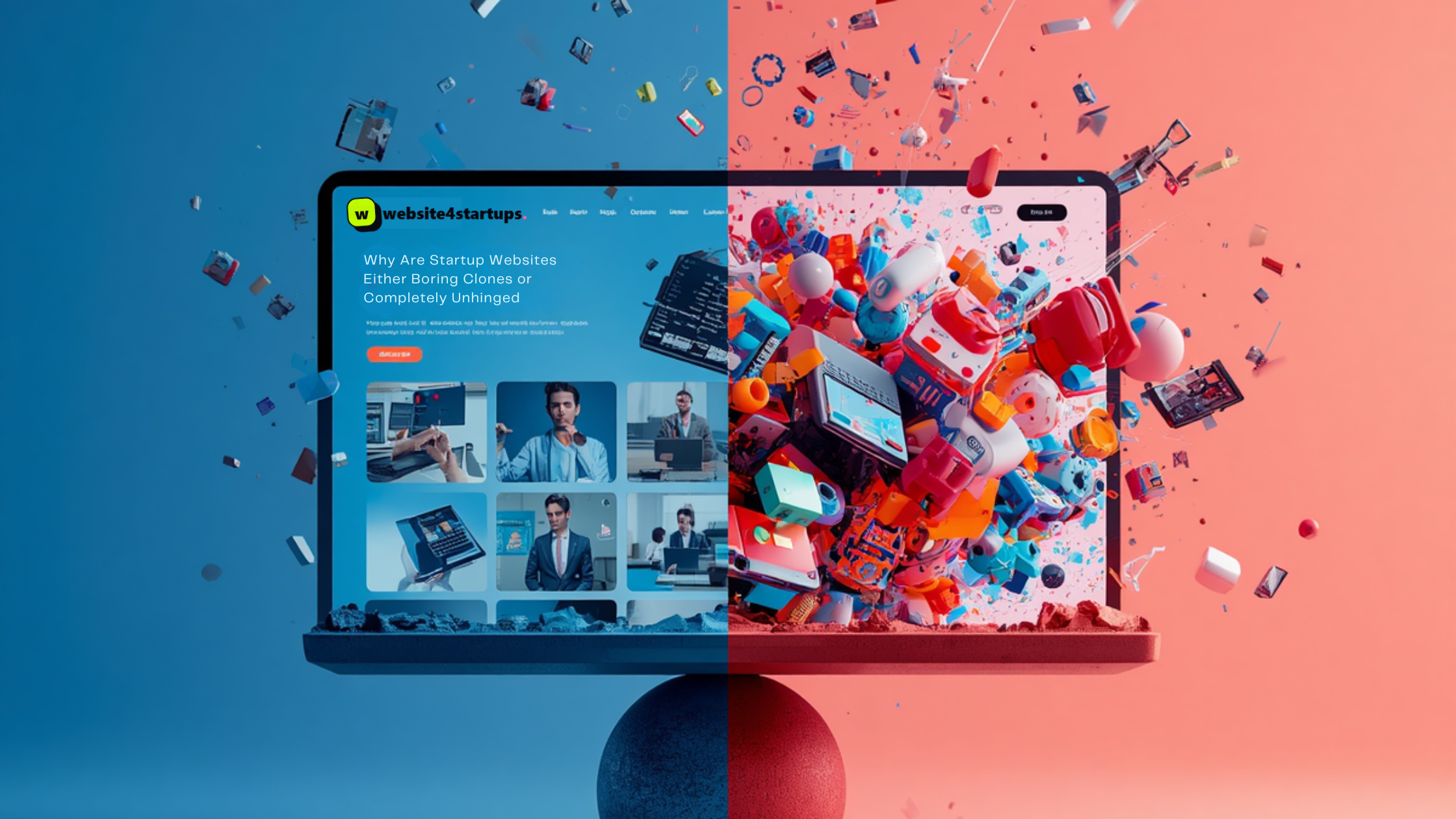
Scroll through your LinkedIn feed or check out a few newly launched brands, and you will notice a bizarre trend. Half the startup websites you click on look like they were built by a corporate robot that has never experienced joy. They use the exact same blue colour palette, the same generic stock photos of people pointing at glass boards, and the same uninspiring buzzwords. They are safe, predictable, and utterly boring.
Then, you hit the other half. This group of sites is one hundred percent guilty of having consumed too many coffees while designing their website. Neon flashing texts, erratic horizontal scrolling where your laptop trackpad gets laggy, enormous floating 3D objects that hinder the visibility of text, and an extremely hard-to-understand navigation system, where a PhD in puzzle-solving is required to locate the shop page. They aren’t just unique; they are completely unhinged.
Here is the lowdown on why getting your brand personality right is so incredibly hard, and how to find the middle ground that actually makes you money.
The Trap of the Corporate Clone
The boring websites usually happen because a founder got scared. Launching a new business is risky, so it feels safest to copy the biggest player in your industry. If the multi-million-pound competitor uses sterile layout blocks and clinical language, then surely that’s the secret recipe, right?
Not exactly. When you copy an established giant, you just end up looking like a cheap imitation. In the modern digital space, blending in is a death sentence. If you choose standard, automated templates from basic web design packages in the UK, you often get a rigid structure that forces your brand to look like every other clone on the internet. You strip out all the human character in exchange for computational perfection, leaving your visitors completely numb.
The Chaos of Trying Too Hard
On the flip side, the unhinged websites happen when a startup tries to force "clout" and personality. They are so terrified of being boring that they throw every single visual trend at the screen at once. They forget that at the end of the day, a website is a functional tool, not a contemporary art exhibition.
If your user interface is so chaotic that a customer cannot figure out how to add an item to their cart or find your pricing info within three seconds, they are leaving. Gimmicky animations and loud fonts do not equal brand identity; they just equal a terrible user experience. True design taste isn’t about making the loudest noise in the room. It’s about making intentional, human choices that guide a reader smoothly toward a sale whilst looking effortlessly cool.
Finding the Sweet Spot Between Safe and Psycho
You don't have to go for either the boring corporate style or an overly hyped Internet experience. The best online stores strike the perfect balance. They make the basic structure clean and snappy, but they add interesting storytelling, original typography, and a conversational voice to engage the visitors.
Getting this balance right means treating your website like a digital storefront, not a template or a playground. When you collaborate with a dedicated web design agency in the UK, you get the technical discipline needed to keep your page speeds fast and your checkout seamless, combined with the creative eye required to give your brand actual soul.
Don’t you want a website that people actually enjoy using? Then, just stop playing around with lifeless designs or over-complicated chaos. Send us an email at Website For Start Ups, and we’ll work with you to create a website design that speaks volumes.