Is Your £850 Web Design Package ‘Cute-alist’ or Just Plain Messy?
2 September 2026
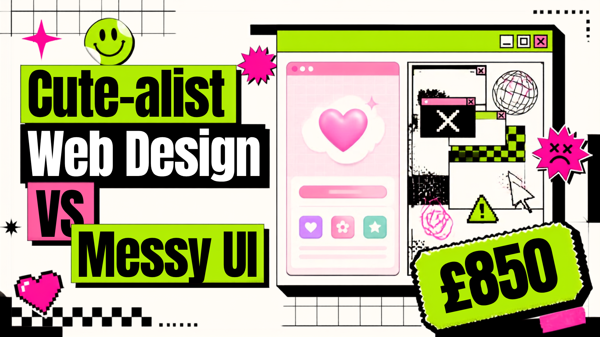
"Cute-alism" is taking over web design, but budget £850 packages often deliver visual trash. Here is how to spot messy UI and build a site with true taste.
If you’ve been anywhere on the internet lately, you know that web design is having a massive identity crisis. The squeaky-clean corporate look with corporate blue gradients is officially out. Instead, everyone is obsessed with "Cute-alism.” That chaotic, Gen Z aesthetic that mixes raw brutalist grid boxes with Y2K stickers, pastel contrasts, bold typography, and playful micro-animations.
It’s fun, it gives off major personality, and when done right, it slaps. But here is the problem: there is a fine line between a site that looks intentionally cool and one that looks like a digital pile of trash.
If you happen to be shopping for web design packages in the UK currently, you might have come across packages worth £850 that claim to provide your brand with an up-to-date facelift. But the real question is: what are you actually buying? True UI expertise, or just plain old visual clutter that will confuse your clients and convert nothing?
What Cute-alism Actually Is (And Why People Get It Wrong)
Cute-alism isn't just about sticking a bunch of graphics and floating text on a page; it's all about contrast:
- Bold Structure: Minimalistic structure with clear borders and blocks, contrasting against rigid grid lines.
- Playful Micro-interactions: Hover animations, click-friendly buttons, and subtle doodles as rewards for users scrolling through your page.
- Smart Hierarchy: Oversized display titles contrasted with ultra-minimalist body text to make people scroll down and actually read your offer.
When designers understand how it works, your store comes alive. But when budget agencies copy this style, they miss the whole structural side of it—they ignore grid balance, use five different clashing fonts, float massive GIFs everywhere, and call it "edgy."
That isn't Cute-alism. That’s just messy UI driving your bounce rate through the roof.
3 Red Flags That Your £850 Package Is Just a Broken Template
If you’re shopping around for a design package, watch out for these dead giveaways:
- Slow Page Speeds Under the Hood: A decent designer optimises each sticker file and uses graphics in lightweight WebP or AVIF formats. Budget companies simply use large, uncompressed PNGs, resulting in mobile website performance as poor as 2008 dial-up internet.
- Zero Mobile Thumb UX: Sure, those floating graphics look cool on a 27-inch desktop screen. But on an iPhone, do they block your "Add to Cart" button? If the mobile layout feels claustrophobic, scrollers leave instantly.
- Typography Chaos: Cute-alism uses quirky fonts for display titles, but your body text needs to be crystal clear. If an agency uses a wiggly handwritten font for your entire product description, visitors won't bother reading it.
Buying from a generic web design agency in the UK often leaves you stuck with bloatware themes disguised as "trendy custom design."
Taste + Conversion = Main Character Energy
You don't need to choose between looking boring or looking completely unhinged. The best startup sites hit the exact sweet spot: bold, personality-driven visual design built on a lightning-fast, conversion-focused core.
At Website For Start Ups, we build custom sites that give main character energy without sacrificing speed, mobile UX, or SEO. No corporate fluff, no broken templates; just pure taste, clean code, and designs that actually turn scrollers into paying customers.
Is your storefront giving mid energy? Book a free 30-minute call with Website For Start Ups today, and let's get your site looking proper.